Many years on and I still am passionate about typography. My first solo show "All the Things She Thinks About" was based on hand lettering. My second solo show "Vern Sherman Drinks Tea and Other Tales" had some elements of typography within it, including the piece LOVE

which was inspired by this street art I snapped while in San Francisco

but now I find that type is not so much a part of my work anymore, yet I still feel very inspired by artists who base their work on the letter form.
Today I came across the work of Nicole Dextras. Her icy typography is stunning to say the least and it got me thinking about other artists whose work I love and admire for their use of typography.

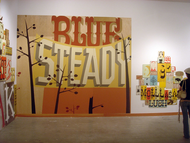
Margaret Kilgallen is another artist whose work I really love. Sadly she passed away in 2001, but left her mark with some amazing type based murals and installations. Small or large, her work is amazing.

In a similar, yet more rustic vein The Date Farmers from Mexico are also inspired by vintage signs. They use typography to a lesser extent than Kilgallen, but it accents their work perfectly.

Herakut have also been inspiring me. I have been poring over their book The Perfect Merge and although they don't always use type they have developed a couple of their own unique typefaces to use in their work.
And I couldn't do this post without mentioning Timba Smits Inspired by vintage advertising, packaging, signage etc, not only is his lettering stunning, but he also has a fine eye when it comes to colour.
